AR KPI Dashboard: Boost Cash Flow & Reduce DSO
Build an AR KPI dashboard to improve cash flow & reduce DSO. Learn essential metrics for professional services firms & how to act on data. Get started in 2026.
On paper, revenue looks fine. Work is delivered, invoices go out, and the pipeline still supports the plan. But cash feels tighter than it should.
That tension usually doesn't come from one catastrophic write-off. It comes from a hundred smaller failures to convert billed work into collected cash. A few invoices stuck in approval. A few clients who always pay after the second reminder. A few disputes that sit in email threads because nobody owns them clearly. By the end of the month, the controller is updating spreadsheets, partners are asking about collections, and QuickBooks still isn't giving a clean forward view.
For firms in the $3M to $50M range, that's where an AR KPI dashboard stops being a reporting nice-to-have and becomes part of cash management. Its true value isn't another set of charts. It's seeing how collection speed, aging, disputes, and customer behavior interact so you can act before cash slips.
The Hidden Drag on Your Firm's Cash Flow
Most professional services firms don't wake up to an AR crisis. They drift into one.
A client pays late, but they're a good account, so the team lets it slide. Another invoice gets held because the PO number was wrong. A project manager says billing should wait until the scope question is resolved. None of these issues look serious alone. Together, they create a steady drag on liquidity.
The finance team feels that drag first. Someone exports the aging report from QuickBooks. Someone else cleans customer names in Excel because the ERP and CRM don't match. Follow-up emails go out late because cash application isn't current. Then collections turns awkward, because by the time finance reaches out, the conversation starts with frustration instead of clarity.
What the problem looks like in practice
A weak AR process rarely announces itself with one obvious metric. It shows up in operating friction:
- Invoices age slowly: The balance isn't alarming until several accounts move past terms at the same time.
- Forecasting gets soft: Cash in the bank doesn't line up with expected collections, so planning gets conservative.
- Staff time gets misused: Senior finance people spend hours assembling status instead of resolving root causes.
- Client relationships get strained: Outreach becomes reactive and inconsistent, which hurts the tone of the conversation.
The worst AR environments aren't chaotic on the surface. They're slow, manual, and opaque.
That opacity is the issue. If you only look at a monthly aging report, you see the symptom after it has already affected cash. You don't see whether the root cause is invoice disputes, weak follow-up discipline, poor onboarding, or a concentration of chronic late payers.
An AR KPI dashboard gives finance a working view of the system, not just the balance. It turns scattered receivables activity into a control layer for improve cash flow decisions. For a CFO or controller, that's the difference between explaining cash variance after the fact and steering it during the month.
What an AR KPI Dashboard Actually Is
An AR KPI dashboard isn't a prettier aging report. It's a command center for receivables performance.

A standard report in QuickBooks or Excel tells you what AR looked like when someone exported the file. A real dashboard tells you what is changing now, where risk is building, and which actions matter first. It pulls invoice data, payment activity, collection status, and operational signals into one view that finance can run from.
If you want a broader sense of how leadership teams structure high-visibility reporting, it's worth taking a look at these BI dashboard examples for leaders. The useful lesson isn't design polish. It's how good dashboards reduce decision lag.
Static reports versus operating dashboards
A static aging report answers one question. Who owes us money, and for how long?
An operating dashboard answers a more useful set of questions:
View | What it tells you |
|---|---|
Top-line collection health | Whether receivables are converting to cash at an acceptable pace |
Process friction | Whether disputes, delinquency, or poor handoffs are slowing payment |
Customer risk | Which accounts need a different follow-up path or credit attention |
Team execution | Whether collections work is timely, targeted, and effective |
That difference matters because AR isn't just an accounting function. It's a live operating system for liquidity. If the dashboard only shows totals, it won't help you reduce DSO. If it shows movement, causality, and exceptions, it can.
What a good dashboard does for finance
The best AR dashboards do three things well.
- They consolidate fragmented data: Billing, ERP receivables, and payment activity sit in one place instead of three tabs and two exports.
- They rank attention: Finance sees which accounts or trends deserve action today, not just what exists.
- They create accountability: When everyone sees the same measures, collection quality becomes manageable instead of anecdotal.
Operator view: If your dashboard can't tell a collector what to do next and can't tell a CFO what risk is rising, it's still a report.
For firms evaluating AR software for professional services, that distinction is practical. You don't need more data. You need a tighter loop between visibility, decision-making, and action.
The Essential Metrics That Drive Performance
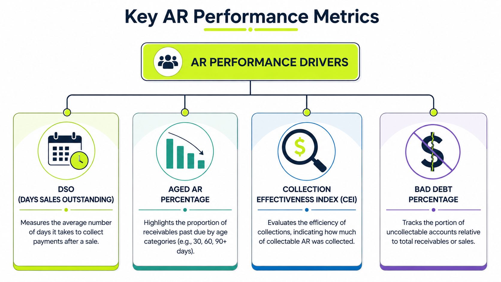
A useful AR KPI dashboard does not rank metrics by popularity. It shows how cash risk moves through the system. In practice, one number rarely gives finance enough context to act. The job is to read speed, quality, friction, and loss together so the team can intervene before a receivables issue turns into a cash problem.
DSO measures collection speed
Days Sales Outstanding, or DSO, is still the anchor metric. It measures the average number of days it takes to convert invoices into cash, using the formula (Accounts Receivable ÷ Total Net Credit Sales) × Number of Days in Period.
For a professional services firm, DSO answers the first operating question. How long does billed work sit in receivables before it becomes cash?
It also has real limits. DSO can worsen because of one large slow-paying client, a dispute cluster, weak follow-up discipline, or delayed invoicing. The metric shows pressure, but not the source of it. That is why I treat it as the opening signal, not the full diagnosis.
If you want a deeper explanation of calculation and interpretation, this breakdown of what DSO means in practice is a useful companion.
CEI measures collection effectiveness
Collection Effectiveness Index, or CEI, is the counterweight to DSO. Its formula is [(Beginning AR Balance + Credit Sales During Period) – Ending Total AR Balance] ÷ [(Beginning AR Balance + Credit Sales During Period) – Ending Current AR Balance] × 100. It measures how effectively the team collected what was collectible in a given period. Versapay's explanation of AR performance metrics provides a solid benchmark for how finance teams use it.
The role of interpretation is vital. A firm can post a tolerable DSO while collection execution is slipping. New billing can keep the average from looking bad even as older invoices age in the background. CEI exposes that pattern fast.
A rising DSO with flat CEI points to broad collection drag. Flat DSO with weakening CEI usually means fresh invoice volume is masking a follow-up problem.
Aging shows where risk is building
An aging table is still one of the most useful views on the dashboard because it locates the pressure. It shows whether the issue sits in current balances, early-stage slippage, or invoices that are now expensive to recover.
The value is in the pattern, not the table itself.
- Current bucket pressure often points to billing delays, client approval bottlenecks, or invoice delivery issues.
- 31 to 60 day movement usually signals weak reminder timing, unclear ownership, or unresolved internal questions.
- Older balances often indicate disputes, stalled escalation, or accounts that need a credit decision instead of another reminder.
For firms carrying meaningful exposure in older buckets, aging should also inform reserve policy. This guide to understanding uncollectible accounts is helpful for framing that discussion.
ADD and disputes explain process friction
Some KPIs belong on the first screen because they explain why the headline numbers moved.
Average Days Delinquent, or ADD, is defined as DSO minus Best Possible Days Sales Outstanding (BPDSO). It shows how long invoices remain unpaid after they are due. BPDSO is calculated as (Current Accounts Receivable ÷ Total Credit Sales) × Number of Days.
Invoice dispute percentage matters for the same reason. It identifies whether payment delay is a collections problem or an operating problem created upstream in billing, contract setup, project delivery, or client approval workflows.
Used together, these metrics help finance separate collection effort from collection blockage.
- High ADD usually means follow-up is late, inconsistent, or poorly matched to customer behavior.
- High dispute volume usually points to invoice quality, contract clarity, or handoff issues between operations and finance.
- If both rise together, the right response is process correction, not just more collector activity.
Bad debt shows whether the front end is controlled
Bad debt is the lagging outcome of poor credit discipline, unresolved disputes, weak escalation, or all three. It belongs on the dashboard because it tests whether the rest of the process is working over time.
I do not read bad debt as a clean-up metric. I read it as proof. If write-offs are rising, something earlier in the cycle is failing. The failure may sit in customer selection, engagement terms, invoicing accuracy, or collection sequencing. The point is the same. Cash leakage started well before the write-off entry.
A strong metric set works together like this:
KPI | Primary question |
|---|---|
DSO | How fast are we turning invoices into cash? |
CEI | How effective is the collection team on collectible balances? |
Aging | Where is risk accumulating by bucket and account? |
ADD | How far past due are invoices staying unpaid? |
Disputes | Are billing or service issues blocking payment? |
Bad debt | Are losses creeping in because of weak credit or poor execution? |
The point is not to monitor six separate numbers. It is to read the interaction between them. DSO shows speed. CEI shows execution quality. Aging and ADD show where delay is forming. Disputes show whether the cause sits upstream. Bad debt confirms whether finance addressed the issue in time. That combination gives a CFO or Controller a working view of cash flow health, not just a record of what went wrong last month.
Designing a Dashboard for Action Not Just Reporting
A dashboard earns its keep in the first five seconds. If a CFO has to hunt for meaning, the layout failed.
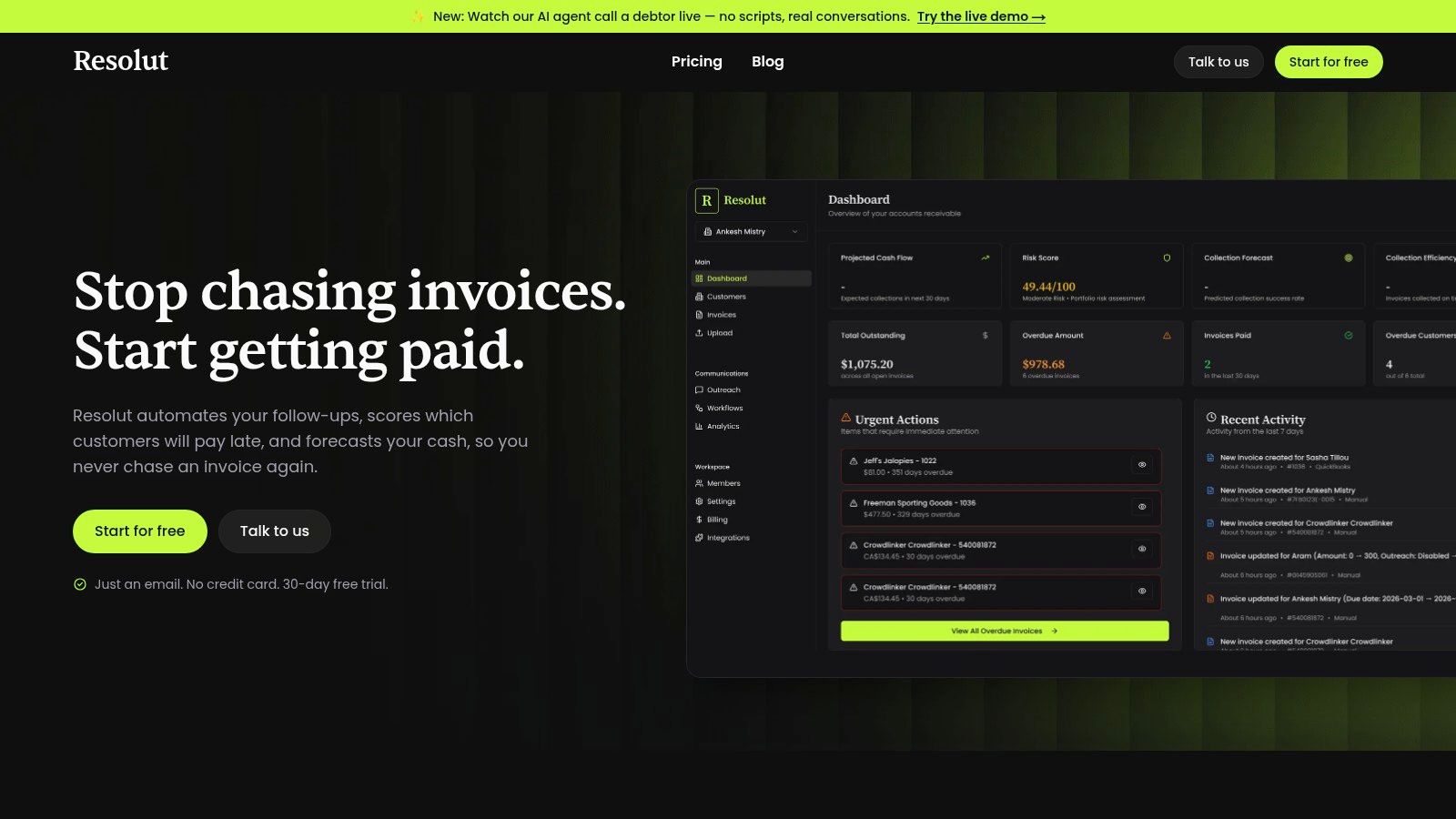
The top row should carry the operating headline. Put your most decision-relevant KPIs there. For most firms, that means collection speed, collection quality, total receivables exposure, and a signal for overdue pressure. Everything below should explain movement in those numbers, not compete with them.
Build visual hierarchy around decisions
A clean AR KPI dashboard usually works best in three layers.
- Top row for executive signals: DSO, CEI, total AR, and one friction indicator.
- Middle layer for diagnosis: Aging by bucket, trends over time, dispute volume, and concentration by client.
- Lower layer for action queues: Priority accounts, collector workload, unresolved exceptions, and items awaiting internal resolution.
Don't use the same chart type for everything. Aging belongs in bars because the movement across buckets matters. Trend lines work well for DSO, CEI, and delinquency. A pie chart is better reserved for concentration views, such as how much AR sits with a handful of clients.
If you want inspiration from a different software category, this piece on dashboard design for AI SaaS founders is useful because it shows how layout can guide judgment quickly. The principle transfers well to finance.
Add the metrics most teams leave out
A lot of AR dashboards stop at throughput. That creates a narrow view of performance.
Insightsoftware points out a persistent gap: many dashboards fail to include customer-centric KPIs such as Customer Satisfaction Score or indicators tied to personalized, omnichannel outreach, which leaves finance teams unable to balance cash discipline with relationship health in its review of AR KPIs.
That matters in professional services. You don't want a dashboard that rewards fast collections while hiding client friction. If a major account pays slowly because invoices are confusing, a dashboard should surface the root issue, not just flag the balance.
Good AR design doesn't separate cash performance from client experience. It puts both in view so finance can choose the right action.
A practical starting point is to pair financial metrics with workflow context. This is especially useful when teams still rely on spreadsheets or a basic accounts receivable aging report template before moving into a more automated environment.
A short product walkthrough can also help clarify what good layout looks like in motion.
Two visual ideas that work well
If you're redesigning the dashboard, these visuals tend to work:
- Trend panel with DSO, CEI, and ADD together so finance can see speed, quality, and lateness in one frame.
- Client concentration heatmap showing which accounts combine large balances with poor payment behavior.
- Cinematic control-room view for leadership meetings, where high-level KPIs sit on top and exception queues run below, making ownership obvious at a glance.
Data Integration and Implementation Steps
An AR dashboard fails long before anyone questions the chart design. It fails when invoice dates do not match across systems, client records use different names, payment status lags by several days, and no one owns the exceptions. In a professional services firm, that gap shows up fast. Partners think collections are under control while finance is still reconciling basic facts.
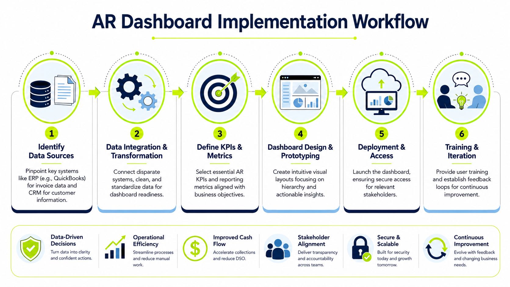
The data foundation is usually straightforward on paper. The ERP or accounting system holds invoices, due dates, credits, and receivable balances. The CRM adds account ownership, billing contacts, and client tier. Bank feeds and payment systems confirm what cleared and when. The hard part is getting those sources to agree well enough that DSO, ADD, dispute volume, and expected cash can be read together as one operating system, not four separate reports.
That distinction matters. If collections look slow, the cause may be billing delay, disputed time entries, unapplied cash, or weak follow-up by account owners. A dashboard only helps if the underlying data lets finance separate those causes quickly.
The practical implementation path
Keep the first build narrow and disciplined.
- Map the source systems first Identify where invoice creation, payment receipt, dispute handling, write-offs, and customer ownership live. In many firms, QuickBooks covers the ledger but not the full collection workflow.
- Standardize customer and invoice keys Match account names, invoice numbers, and parent-child relationships across systems. If those keys are inconsistent, every aging review turns into manual cleanup.
- Define metric ownership Assign one owner for each metric and queue. DSO may sit with finance leadership, but dispute aging, unapplied cash, and broken billing workflows need named operators.
- Set refresh timing based on decisions Daily updates are enough for some firms. Others need intraday payment visibility because collectors, billing, and cash application are all working the same accounts. Pick a cadence that matches the action you expect the team to take.
- Prototype the executive page before full build Start with the view used in weekly cash reviews. If leadership cannot spot concentration risk, late-stage aging, and blocked invoices in one screen, the rest of the dashboard will not rescue the project.
Manual BI build or dedicated platform
The main choice is whether to assemble the dashboard in your BI stack or use a platform that already connects reporting with workflow.
Option | Best for | Trade-offs |
|---|---|---|
Manual BI stack | Firms with internal analytics support and stable processes | Flexible, but slower to maintain and easier to break when source fields or workflows change |
Dedicated AR platform | Firms that need faster deployment and collection workflow support | Less custom at the edges, but usually stronger operationally |
A manual build can work well if finance and operations keep source systems clean and someone owns the model. I have seen Power BI setups deliver good visibility for firms with disciplined billing and a capable analyst. I have also seen the same setup lose credibility once notes sit outside the system, disputes are tracked in email, and bank activity posts later than the collection team expects. At that point, the dashboard starts showing stale conclusions.
A dedicated platform makes more sense when the same team is chasing past-due invoices, resolving short-pays, and closing the month. It reduces the handoff problem between visibility and execution, especially for teams evaluating what AR automation should cover in practice.
Implementation rule: Fix naming, ownership, and workflow before you polish the visuals.
That is the difference between a dashboard that reports old problems and one that helps prevent the next cash shortfall.
From Insight to Action with AR Automation
A dashboard tells you what is happening. Automation determines whether anything improves this week.
That's the shift many firms miss. They invest in visibility, but the follow-up still depends on someone remembering to send the next email, update the note, reassign the dispute, or call the account owner. The dashboard becomes informative but passive.
What action looks like in a live AR environment
Once key metrics are visible, the next step is to attach rules and workflows to them.
If an invoice moves into a more serious aging bucket, the system should trigger the next collection step. If a dispute is opened, the account shouldn't keep receiving generic reminders that ignore the issue. If a customer consistently pays late but reliably responds to a specific channel, outreach should adapt to that pattern.
That is where AI AR automation can be useful without becoming gimmicky. The point isn't to replace judgment. It's to handle timing, prioritization, and message sequencing with more consistency than a busy finance team can manage manually.
Typical actions tied to an AR KPI dashboard include:
- Collection sequencing: Reminder emails, escalations, and task routing based on aging or risk.
- Exception handling: Distinguishing disputed invoices from ordinary overdue balances.
- Cash application support: Updating status faster so collectors don't chase invoices that have already been paid.
- Customer-level tailoring: Matching cadence and communication channel to known payment behavior.
Why the connection matters financially
The financial case for AR automation is stronger when it is tied directly to dashboard insight.
A study by Vanson Bourne found that 100% of finance professionals using AR automation software reported measurable gains, including faster payments, and firms that fully embraced the technology achieved a 40%+ reduction in Days to Pay according to Billtrust's review of automation ROI.
That result matters because dashboards alone don't reduce DSO. Action does. The dashboard identifies risk and bottlenecks. Automation enforces follow-through across every invoice, every customer, and every day.
If you're weighing the operating model itself, this explanation of what AR automation changes in practice is a helpful reference.
What works and what doesn't
In professional services, a few patterns tend to hold.
What works:
- Automating the routine path so the team can focus on disputes and high-value exceptions.
- Using workflow logic tied to aging and customer behavior instead of sending the same message to every account.
- Keeping a human approval layer for sensitive accounts where partner relationships matter.
What doesn't work:
- Blind batch reminders that ignore disputes, promised payment dates, or recent contact history.
- Separate tools with no shared context between billing, collections, and cash application.
- Dashboards without workflow ownership where everyone sees the issue and nobody resolves it.
Automation is strongest when it makes the right action easier, not when it floods customers with more activity.
For firms comparing AR software for professional services, that's the bar. The platform should help finance reduce DSO, improve follow-up consistency, and protect the client relationship while doing it.
Regain Control of Your Cash Flow
Cash control in a services firm starts with visibility, but it doesn't end there.
A strong AR KPI dashboard lets finance see the receivables system as it operates. Not just balances, but speed, quality, friction, and risk. Once those signals sit in one place, collections stops being a monthly cleanup exercise and becomes an operating discipline.
That changes the tone of the finance function. The controller isn't patching together status from spreadsheets. The CFO isn't guessing which late balances are noise and which are a real threat to liquidity. The firm can make better decisions earlier, with less internal friction and less strain on client relationships.
Resolut automates AR for professional services, consistent, accurate, and human.
If your team is still managing collections through exports, inboxes, and manual follow-ups, Resolut is worth a look. It gives professional services firms a more controlled way to connect visibility with action, so AR runs consistently, cash arrives faster, and the process still feels human.